Virgin Experience Day's required a new website header and navigation to improve their user experience, help enhance their brand identity, and boost SEO performance.
Also to make it visually appealing, easier to navigate, and better align the company's current branding and marketing strategies.

Enhancing the website header and navigation will involve simplifying the overall look and feel of the design, ensuring a better responsive experience, and maintaining clear branding. A intuitive, accessible navigation with consistent positioning will improve usability. Adding call-to-action buttons, visual icons and using analytics for optimisation will further enhance the user experience - as well as merchandising.


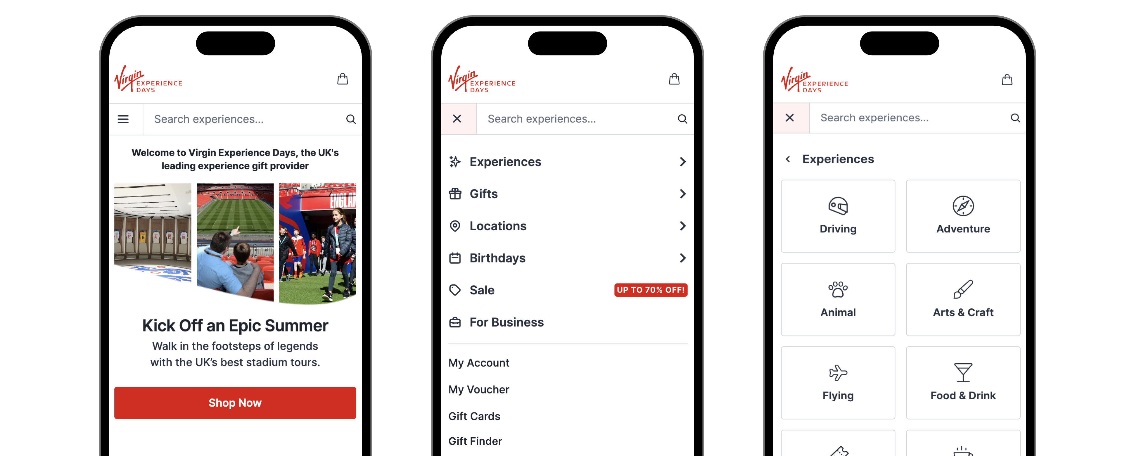
The logo is placed at the top-left corner for familiarity and branding, while the search bar is positioned below and exposed for ease of use and accessibility.

The use of typography and colours aligns with the overall design of the website and includes links to lesser-visited/busniess type pages like "Blog," "Things to do," "Help," or "My Account." Additionally, incorporating icons in the navigation listings helps to enhance visual appeal and improve the user experience.

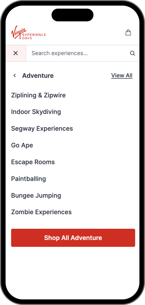
Call to Action (CTA) buttons like "Shop All Adventure" or "View All" guide user navigation. Prominently placed at the top and bottom of listings, they stand out and enhance user experience, boosting engagement and conversions, if the listing is overwhelming.
The desktop version had too many uncategorised links and lacked clear, concise information, overwhelming users. Additionally, the absence of colour, icons, and effective typography worsened navigation and user experience.


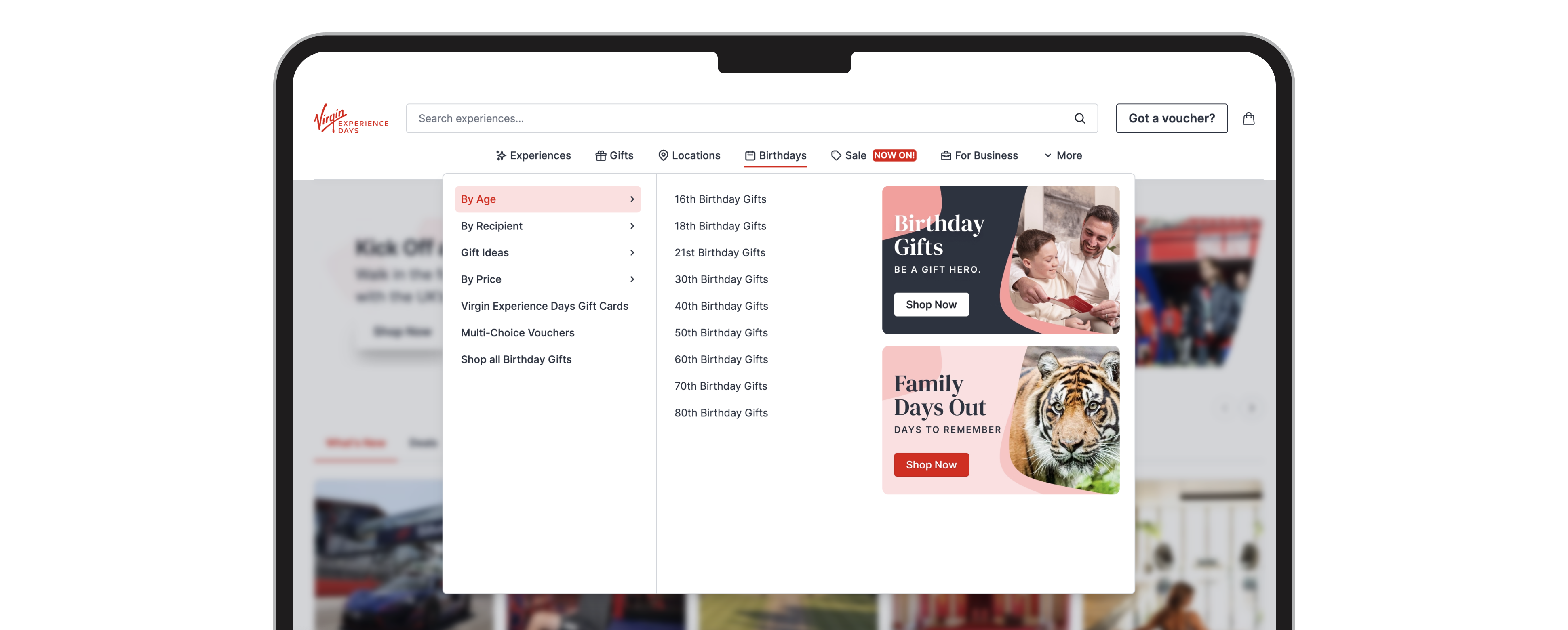
Streamlined, slick, bitsized information with just the right amount of links to provide clear categorisation and comprehensive information. Additionally, the tasteful use of colour, icons, typography, and widget banners enhanced usability, creating a more engaging and user-friendly navigation experience. Catering for desktops large and small (before filtering down to mobile device views).

