Overview
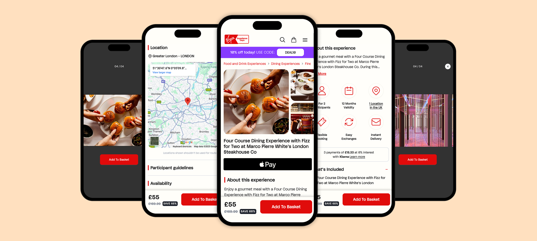
Virgin Experience Days, a retailer of experience gifts, had its product detail pages (PDPs) redesigned for the UK and US markets to balance clarity with inspiration. The redesign improved the accessibility of key product information, making pages more engaging and visually appealing.
My Role
Owned the end-to-end redesign across both markets, collaborating with Product and Development teams. Defined user flows, layouts, and high-fidelity prototypes while guiding mobile-friendly interactions.
Tools & Methods: Figma, wireframing, component creation, prototyping for the CEO and key stakeholders.
The Challenge
The PDPs faced multiple issues and pain points:
- Dense, text-heavy layout
- Uninspiring experience
- Poor mobile usability with lots of scrolling and less interactive
Research & Insights
Analysis highlighted opportunities to improve:
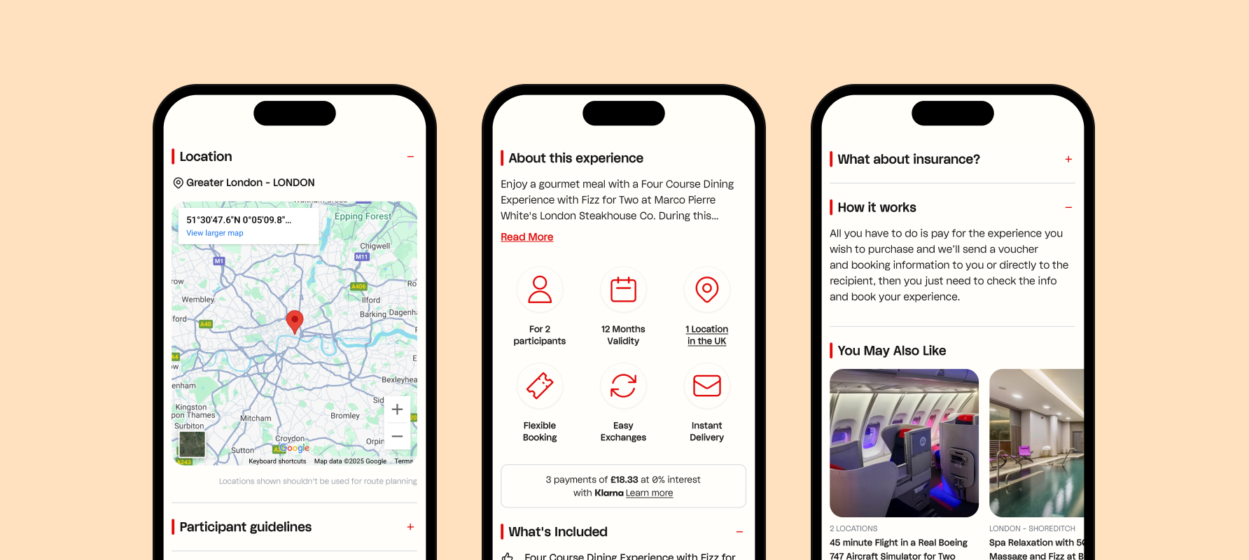
- Surface essential information upfront, with collapsible sections for secondary content
- Better use of engaging imagery and typography to create an emotional connection
- Make delivery, validity, and gift options more prominent
Competitor patterns also revealed that sticky CTAs, swipeable galleries, and simplified mobile layouts improved engagement.
Wireframes
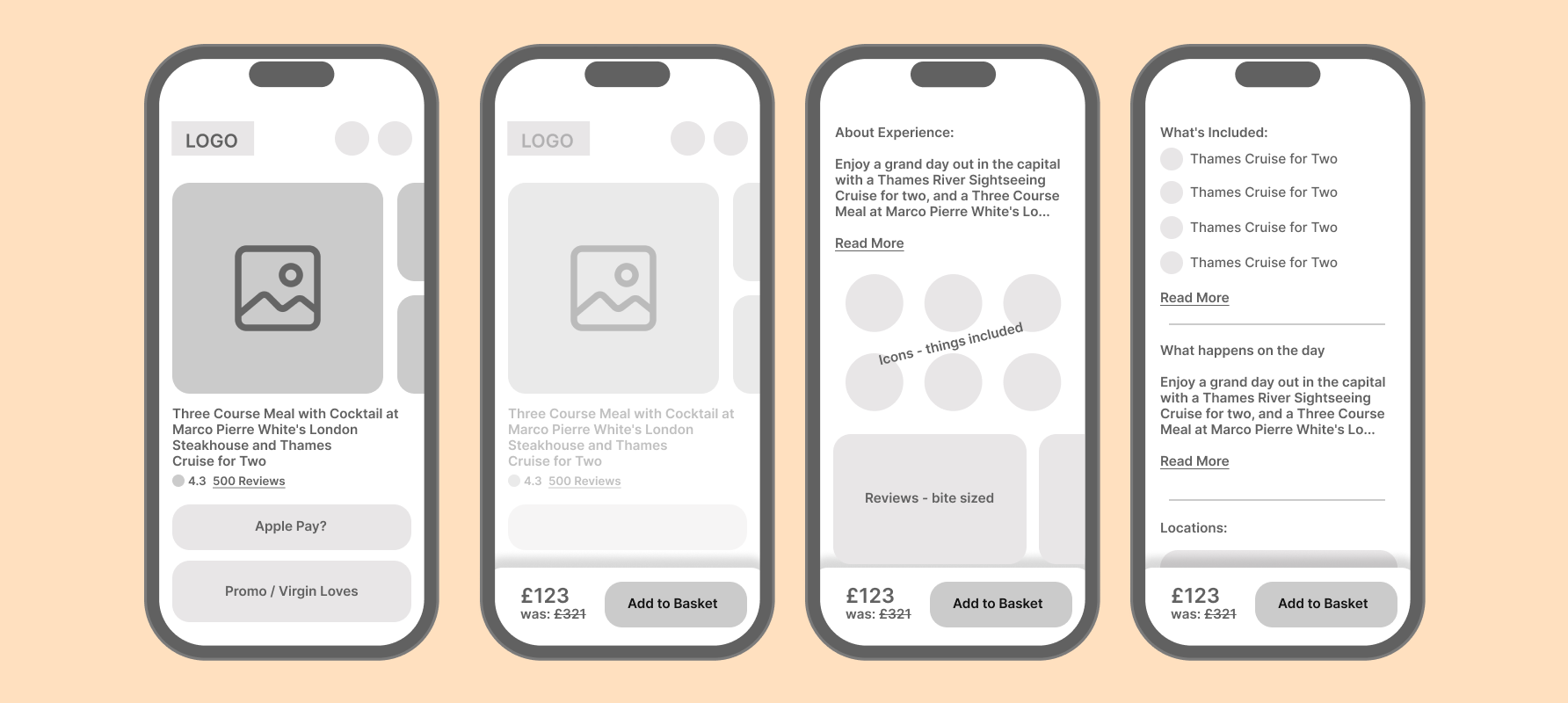
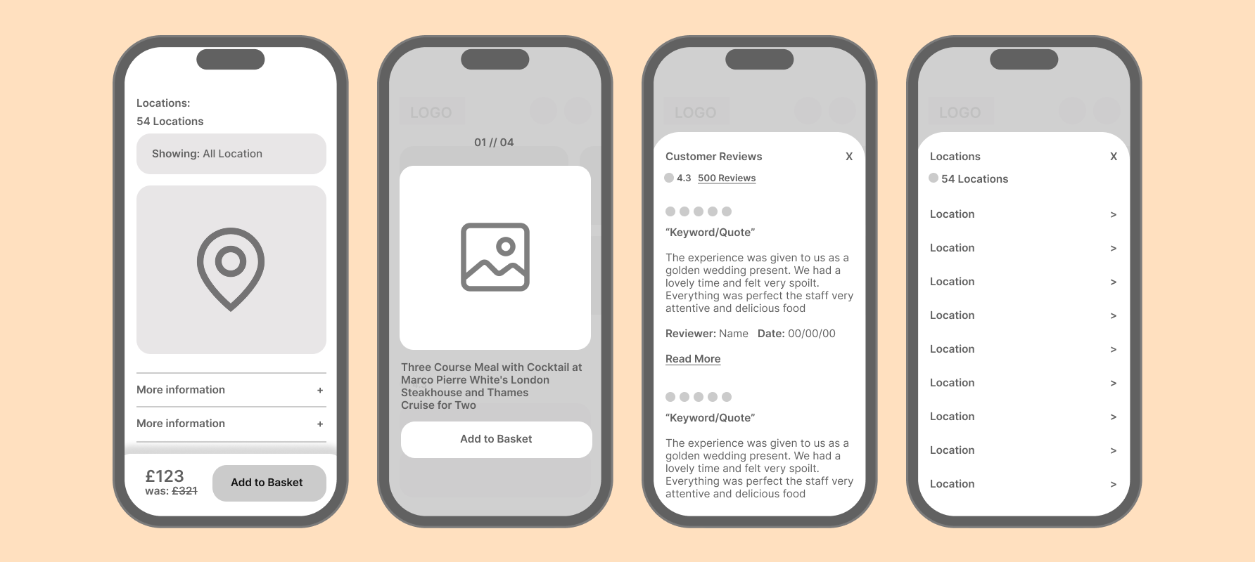
Wireframes helped clarify layout, content hierarchy, and mobile flow while providing developers with an early structure. A shared blueprint before high-fidelity design.
Key Improvements
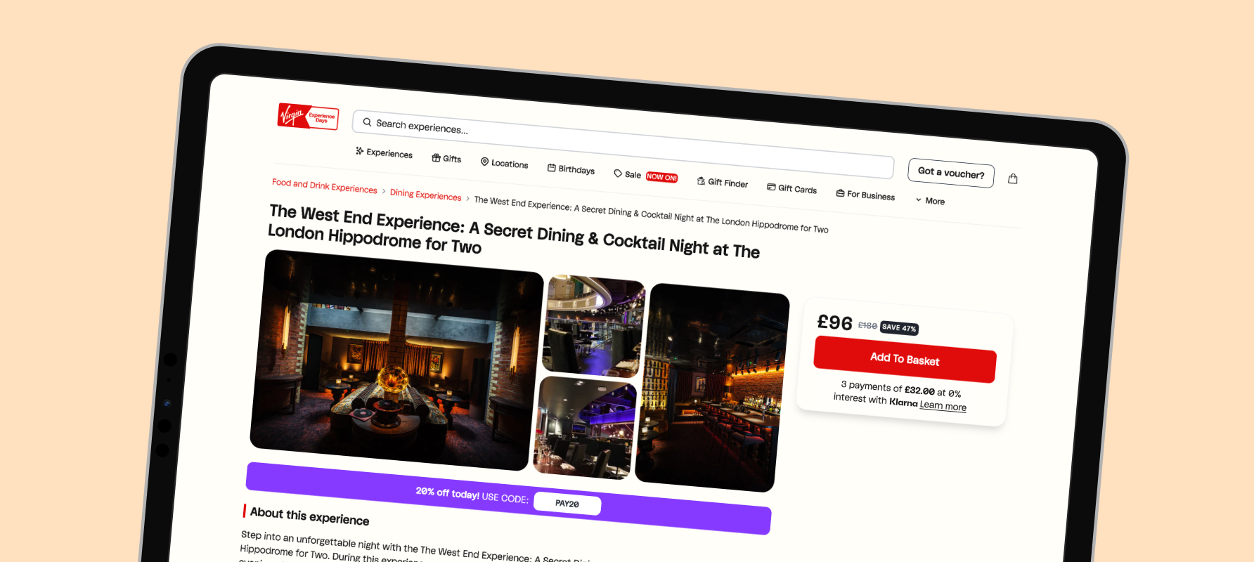
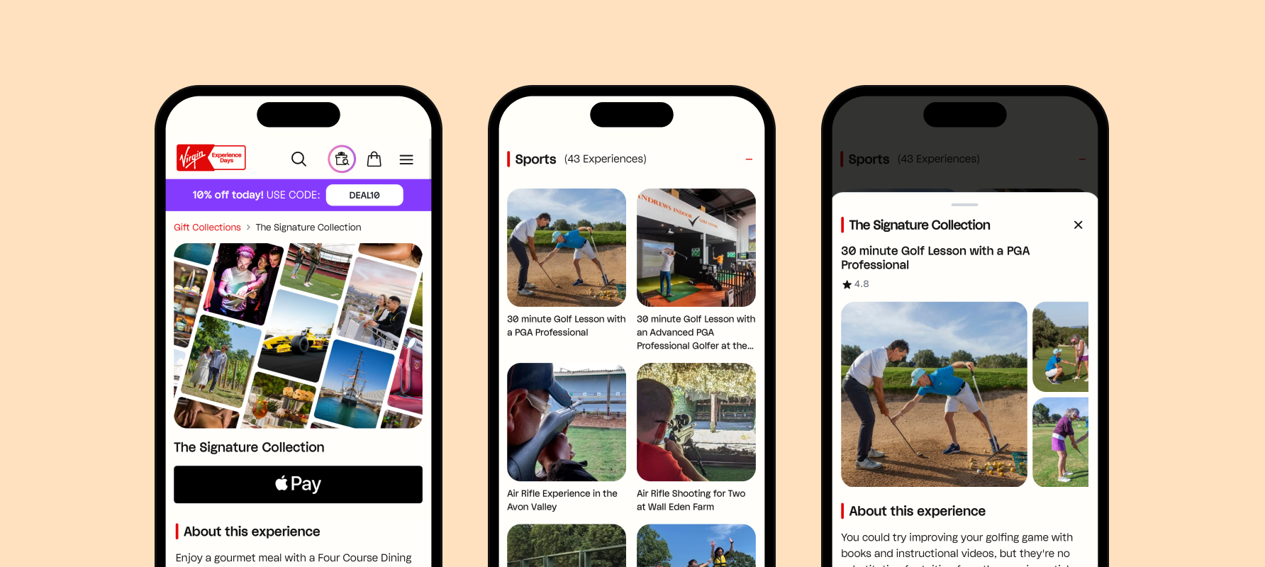
The page was restructured to surface essentials such as price and availability first. Enhanced the swipeable/gallery type imagery, clean typography created stronger visual impact, and mobile users benefited from collapsible sections, informative modals and always-accessible CTAs.
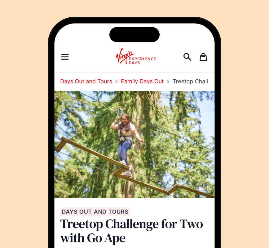
Before
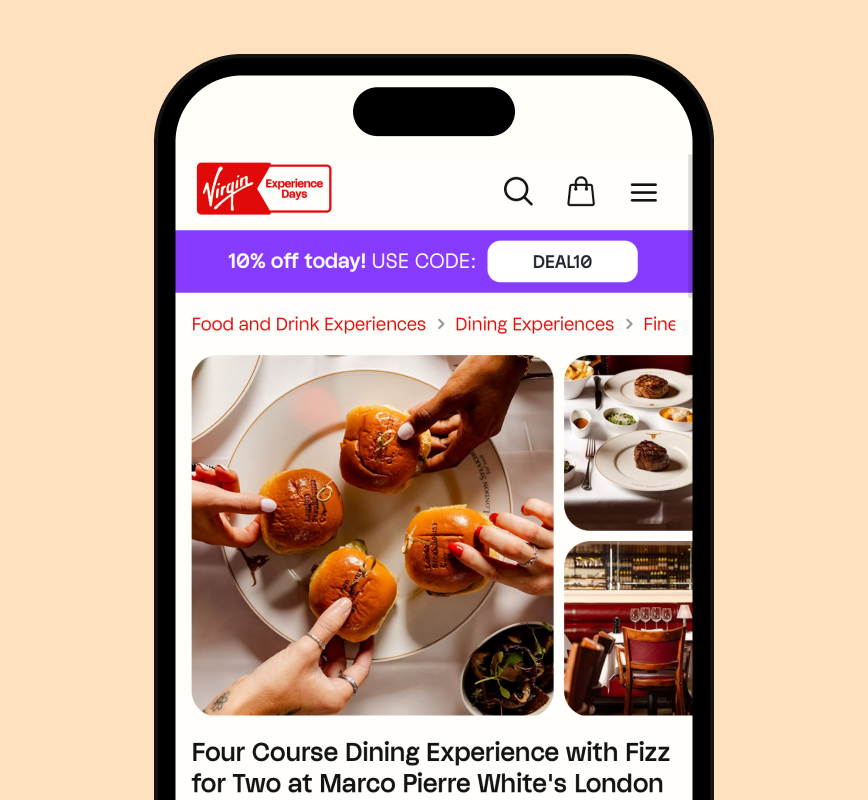
After
Outcomes & Learnings
After launch, product page exits decreased, with customers engaging more with the bite-sized information. Stakeholders noted that the clearer presentation of these formats played a key role in boosting conversion.
